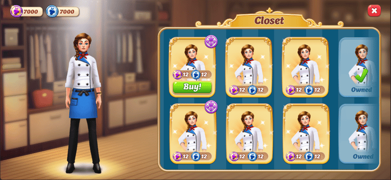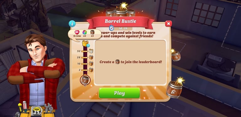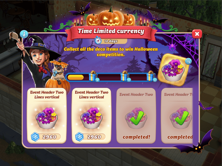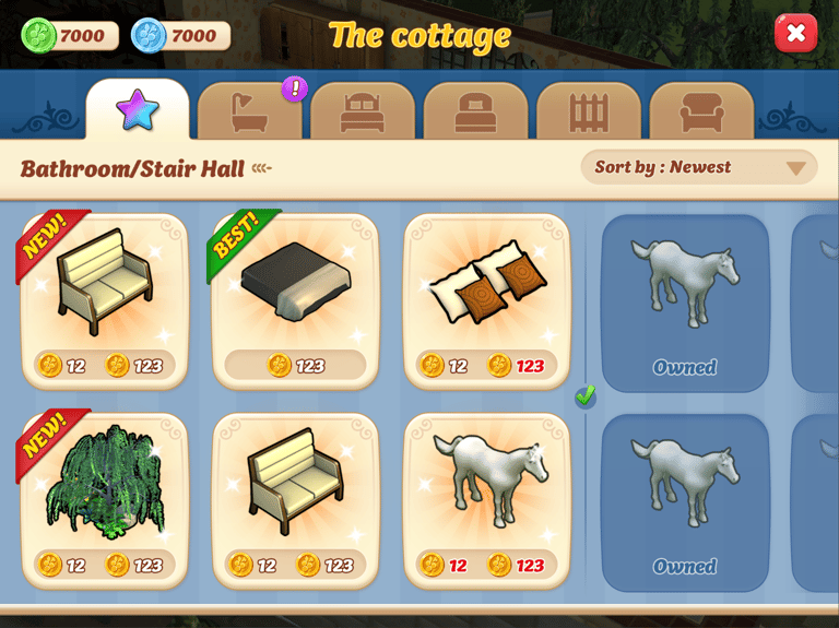
Overview
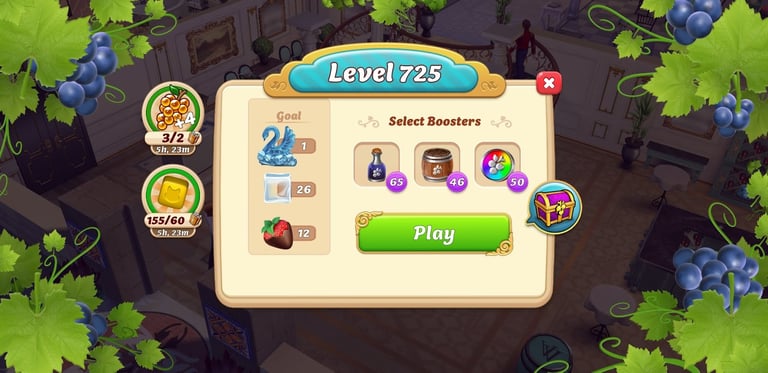
I joined the team right after the game’s release. The rushed launch left many features needing redesign or development. One of my projects focused on modernizing and adding color to the game’s design.
Sr. UI/UX Designer (Oct 2019 - Aug 2024)


Skills & Tools


Objectives
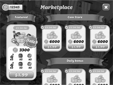
The fixed left side (featured) makes it hard to view all sales visually at once as the coin store scrolls vertically.
Uneven spacing between elements results in a cluttered appearance.
The ribbon/title bar takes up excessive space. A coin store title bar is unnecessary when coins are already in the sale container.
The container and buy buttons are too small, limiting usability.
Limited space for featured or event sales.
Goal
Introduce more vibrant and dynamic colors to make the sales items pop. Adding bold and engaging color schemes will draw attention and create a more fun and exciting shopping experience for players.
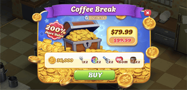
Move the Ribbon Title: Place the ribbon title inside the sale container rather than outside, maximizing space and reducing clutter.
Diverse Sticker Options: Introduce multiple sticker shapes and colors with various texts like "Sale," "New," "Best," "Limited," and discount percentages (10% off - 90% off). Ensure that only one sticker is used per sale item.
Horizontal Scrolling: Implement horizontal scrolling to display more items at once, improving visibility and accessibility.
Extend Sales Area: Add a "More" button at the end to expand the sales area, allowing for selective display of sales items to players.
Competitive Analysis
Looking at some competitor games like Tuscany Villa and Homescapes, they feature colorful, modern designs with fast-paced, round-to-round gameplay.
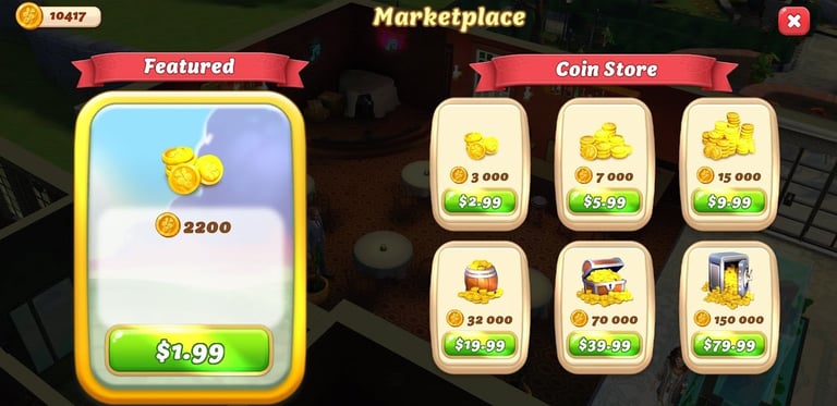

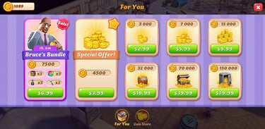
Previous Marketplace screen
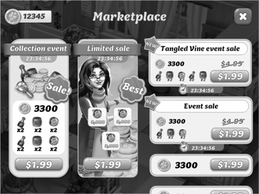
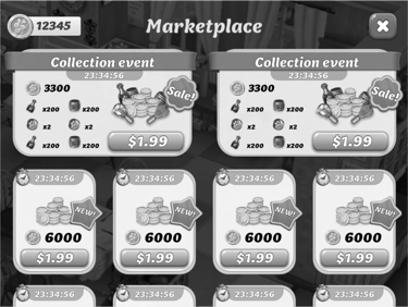
Layout explore
Provide a variety of design options to determine what best meets our players' needs, while also considering the target age group. This approach ensures that the visual style resonates with our audience and enhances their experience.
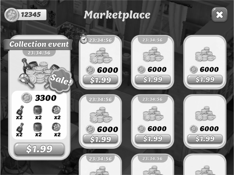
Keep the current layout
Right-Side Vertical Scroll
The left side (featured) being fixed limits the amount of space available for promoting key sales or events.
Players may not fully engage with the featured items if they remain static.
The vertical scroll on the right side may cause a disconnect between featured items on the left and the items listed on the right.
The visibility of all sale items at once is reduced, requiring players to scroll frequently, which could lead to missed sales opportunities.
Optimized Visual Hierarchy
Prioritize Key Sales: Use visual hierarchy to highlight key sales or events by employing larger fonts, brighter colors, or animations to make them stand out.
Reduce Clutter: Eliminate unnecessary elements like the coin store title bar, as it’s redundant when the coins are already present in the sale container.


Limited Featured Space:
Balanced Layout
Adjust Featured Space: Expand the space for featured items to allow for more dynamic content that adjusts based on player behavior or sales events.
Even Spacing: Ensure consistent spacing between elements to create a cleaner, more organized layout.
Multiple layout options
Final layout & Prototype
Introducing a horizontal coin store layout with tab buttons can significantly enhance the user experience by making it easier for players to navigate through different sales and offers. Here's how you can structure this layout
Horizontal layout with tab buttons
Tabs for Navigation
Tab Buttons at the bottom: Place tab buttons at the top of the screen, allowing players to switch between different categories such as “Featured,” “New,” “Best Deals,” “Limited Time,” etc.
Active Tab Highlight: Use a clear visual cue (e.g., bold color or underline) to show which tab is active, helping users understand their current view.
Horizontal Scroll for Coin Store
Horizontal Scroll Bar: Display the items in a horizontal scrollable container. This allows players to easily swipe through the store items, making the browsing experience smoother and more engaging.
Edge Panning: Ensure there is a small visible portion of the next item, encouraging players to swipe and discover more offers.
Protopie prototype
Additional Features
Expandable Sales Section: Add a “More Deals” button at the end of the scroll area. When clicked, this expands the sales area, allowing the user to view additional items without leaving the current screen.
Quick View Option: Consider adding a quick view feature that shows more details about an item when hovered over or tapped, without requiring players to leave the main screen.
Consistency and User Engagement
Seamless Transition Between Tabs: Ensure that switching between tabs is smooth, with minimal loading time, to maintain a consistent flow.
Event-Driven Changes: Update the featured tab automatically during special events, ensuring players see relevant offers first.
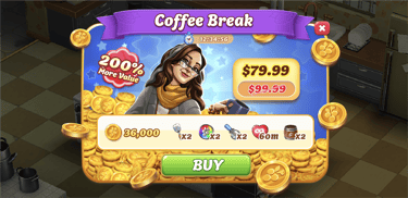
Final HiFi


Work Gallery
These are the projects I owned as a stakeholder from start to finish.
